The client envisioned an animated advertisement for the their school and the deadline was also of 2 weeks. This work was bout forward to me by my friend and mentor Anoodha the owner and Creative Director of Curiouser, Kochin also the script writer for the narrative you hear playing at the Background. Since the deadline was too tight we had to finalise the visual development of the ad in the start and make sure the client loved it.
The ad should look like it was an act of child or something very simple which is child like and appealing to the grownups as well who are majorly the target audience.
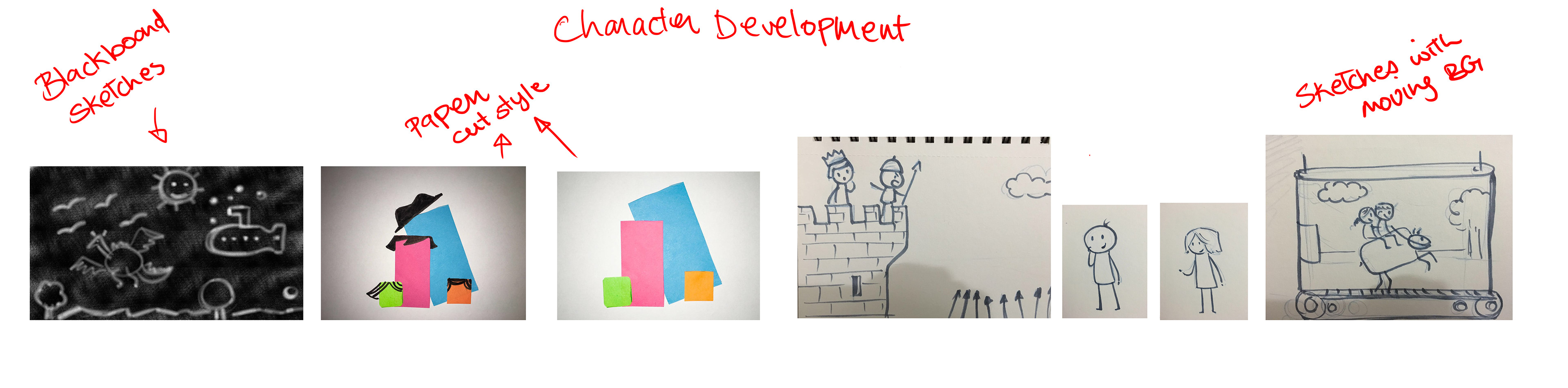
Below you can see the styles i approached to do the video once i heard the script.
I thought we could we could execute it with simple shapes or black board sketches which are appealing and stands out. But finally Anoodha, me and the client agreed upon the simple figures representing the children on the right.
Below are few animation tests of the simple shapes, I thought to show how to bring out the playful characteristics of a child in a simple shape.
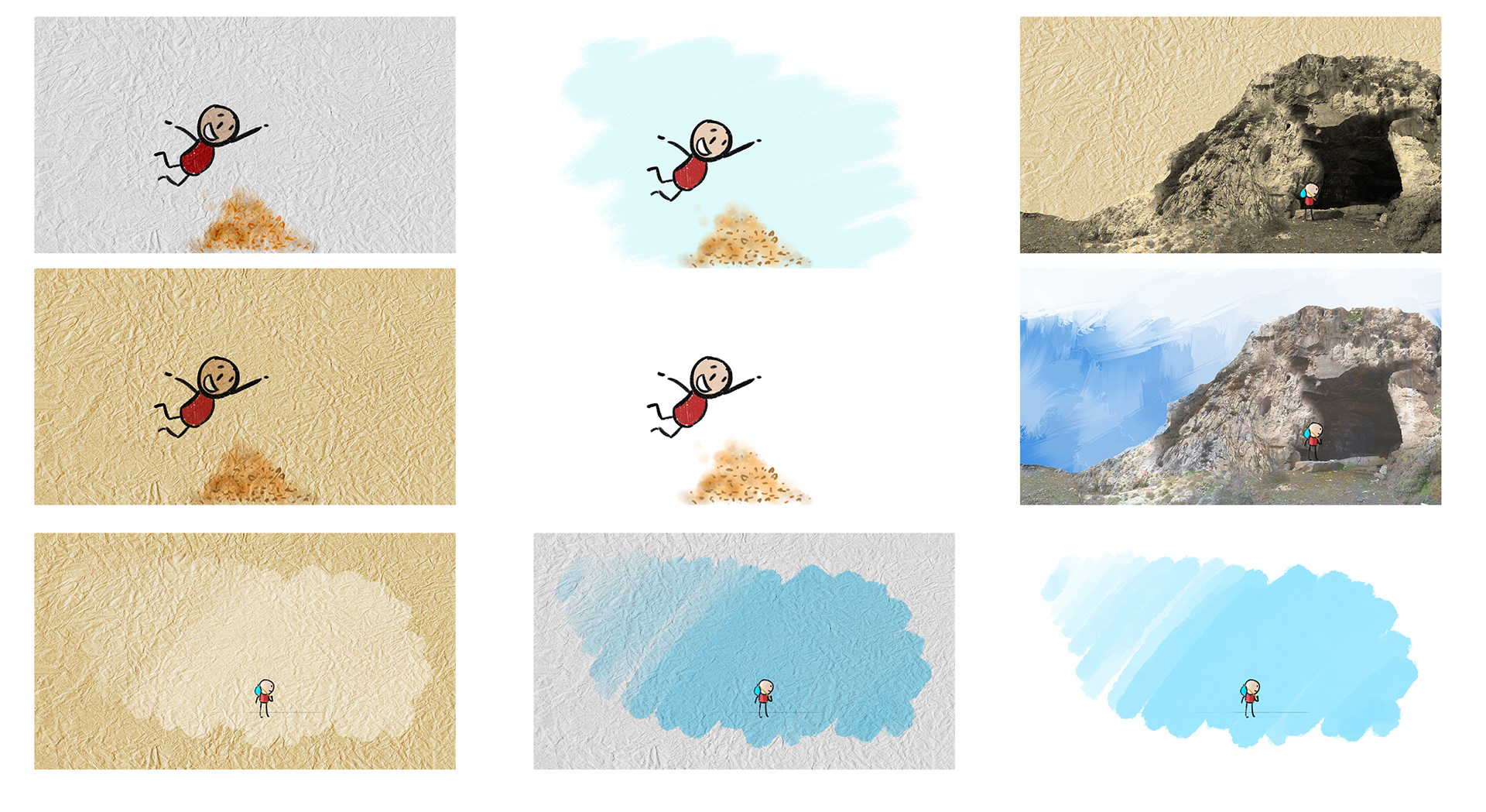
Below are the different Visualisations in other words the look and feel for the video.
After the Character Designs was finalised we started working on the storyboards and animatic along with the visual development process. The animatic is the breakdown of the flow of the story with key drawings in sync with the audio which was recorded after the script was finalised.

Below is the final animation which was aired, few minor changes were made at the compositing stage. This ad was so well received by the client that the Client Sanskara Schools Facebook page started making posters inspired by the simplicity and stylization of the video.