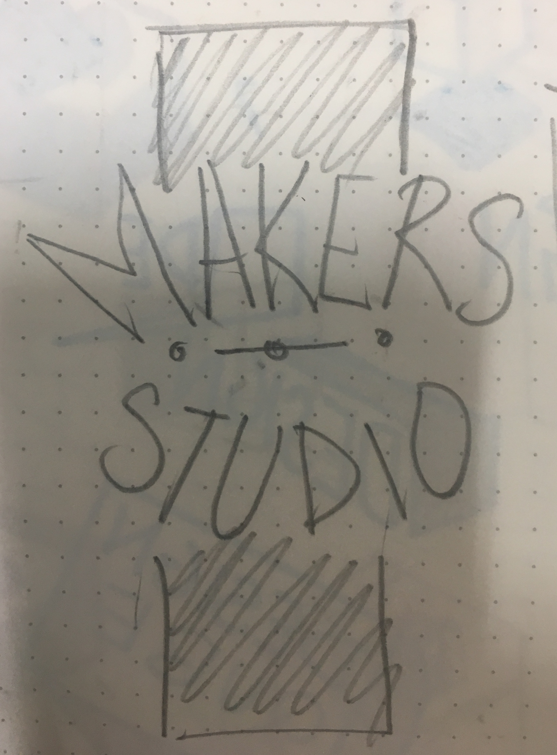
The Client, Makers Studio came with a request for a Logo for their Production Company. This is their debut film production in Kollywood(Tamil Film Industry). Few days before the Motion poster launch of the film they had asked for the Logo design. As I spoke the team at Makers Studio I realised they don't have any idea of how it should look, they just told me it should me simple. I started with few sketches but one design kinda stayed in my head just after the phone call had ended, i went on with that. I did a rough design to show they what i visualised and made a Gif.

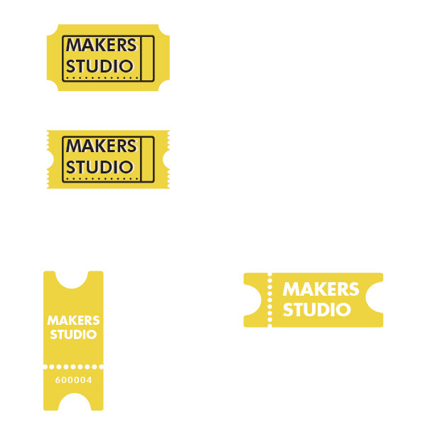
I showed it and 'Voila'they loved it, surprisingly the whole team loved it. But they had a suggestion if I could add a or make it more related to films by making an icon or from symbol which viewers could relate to a Media Production Company. I went on with making a film frame and a vertical ticket with the company logo in it. They all preferred the vertical ticket. They wanted it to be more simple!

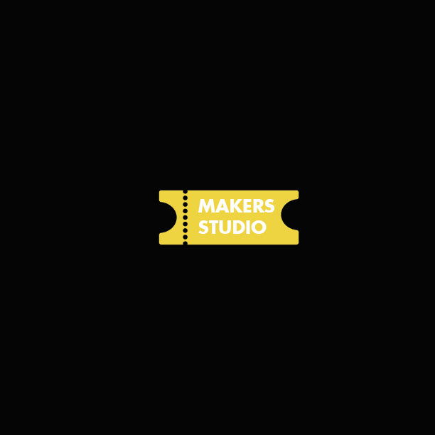
I chose the ticket shape and made it horizontal and vertical and tried with shapes and digits at the bottom which represents the postal code of where the Company exists, which is Mylapore (6000004) .That was inspired from the longitude and latitude from the globe, though that would have been too detailed i though of sticking to the postal code.
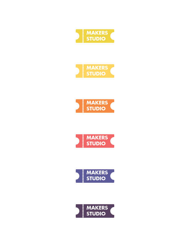
They loved the Horizontal one, with no Postal code( I loved that touch :( I gave them few more colour options to choose from, they told me they would change the colour according to their preference. and though the LOGO was born.
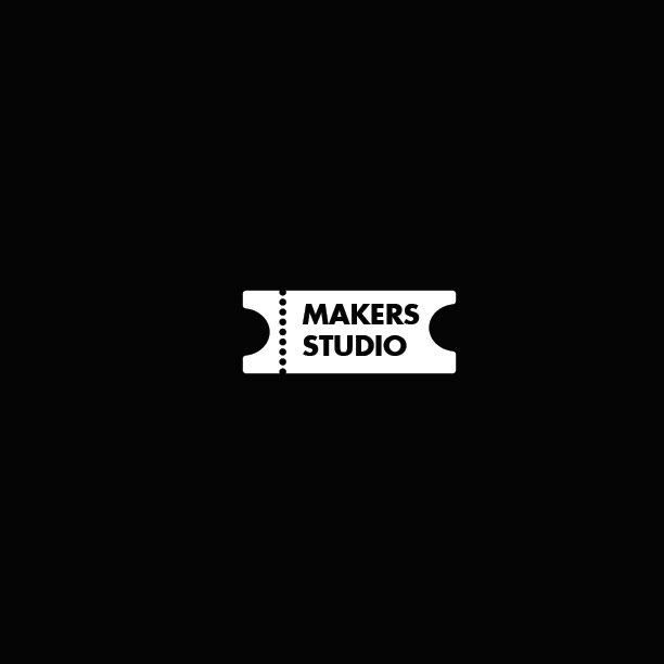
They Choose to go with the white logo on black background rather than yellow as their film was a serious one and nothing can shoe serious than Black or White. Yellow was being a little playful.
This icon below will take you too a YouTube link with the logo revel and the Movie's Motion Poster release